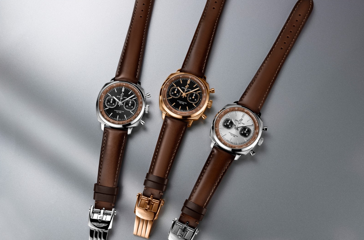
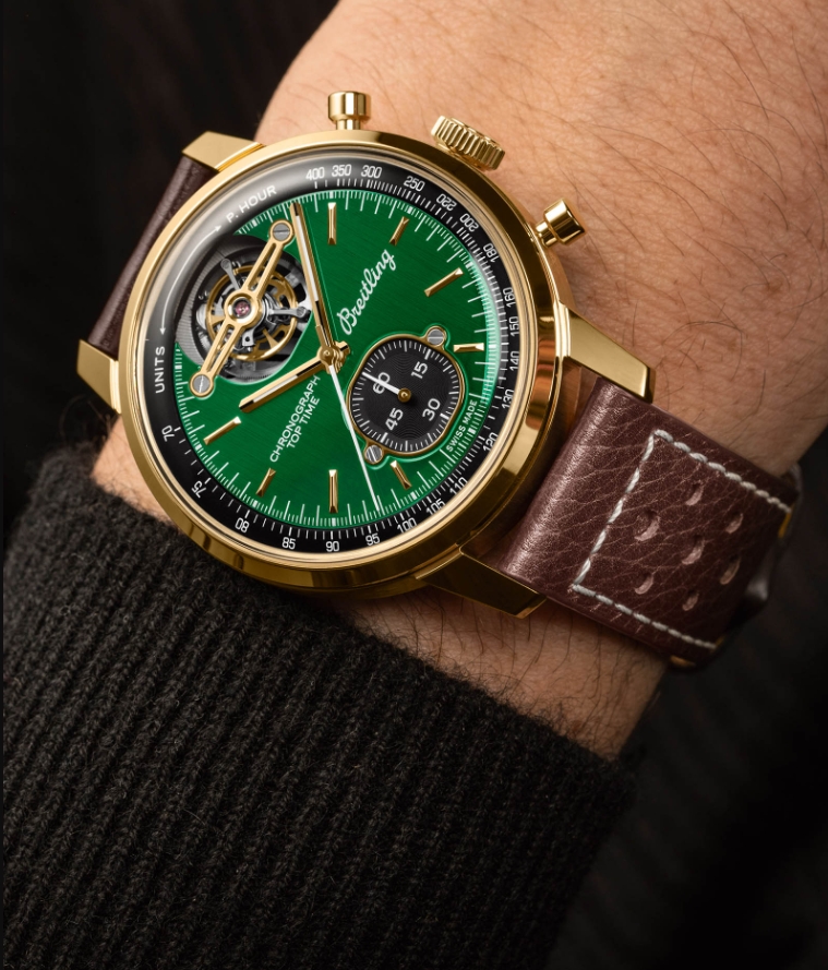
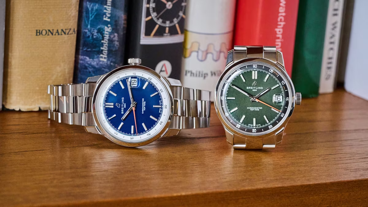
Putting every Breitling watch into one quality checklist is a mistake. A modern Endurance Pro and a vintage-inspired chronograph may carry the same brand name, but the design goals are completely different. One depends on lightweight materials and bright technical styling; the other may be defined by restrained proportions, aged-looking lume and traditional case shapes.
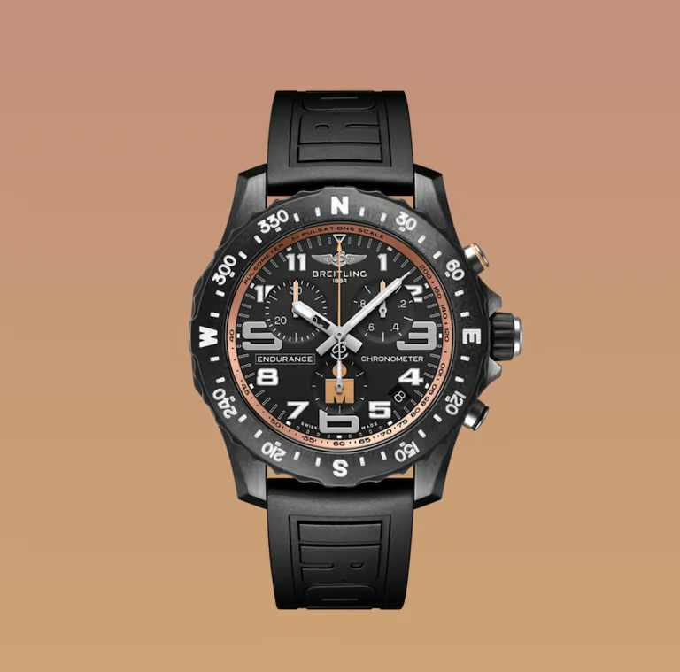
Modern Breitling models often use materials and construction techniques that become part of the visual identity. The Endurance Pro, for example, is known for its lightweight Breitlight case and colourful accents. A replica can copy the silhouette while using a different material, so appearance and construction should be evaluated separately.
Vintage and vintage-inspired pieces create another challenge. Slightly smaller cases, narrower bezels and simpler typography can make a watch look wrong if modern proportions are imposed on it. Artificial ageing is also easy to overdo. For those models, case profile, dial printing, lume tone and hand shape are usually more important than headline specifications.
Compare the reference, not the marketing phrase
Our Breitling collection notes separate individual families so readers do not have to rely on generic labels. The same principle runs through Nurluk: understand the original watch first, then judge the replica interpretation against the characteristics that actually define it.
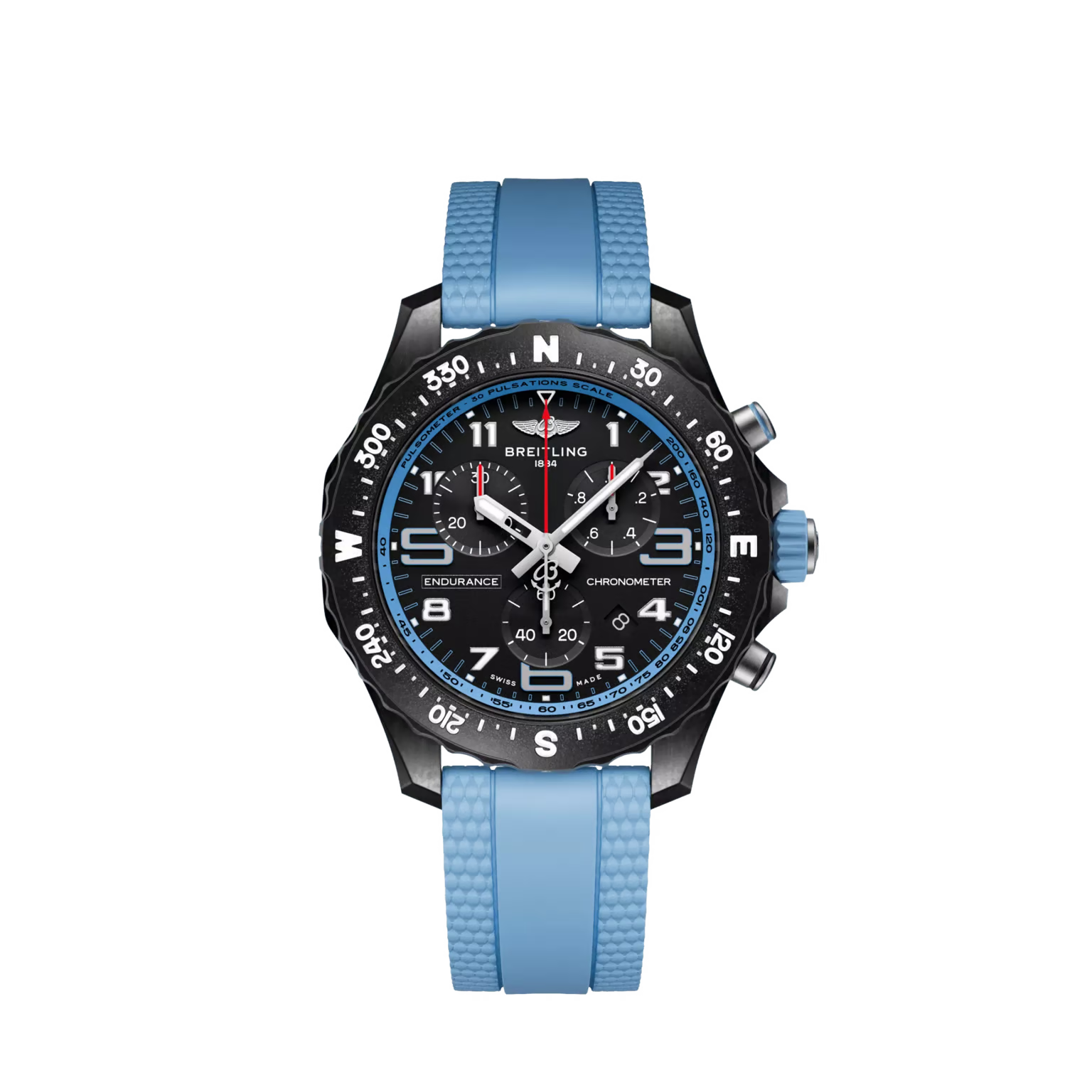
Age also changes what “accuracy” should mean. A faithful vintage-style interpretation may intentionally use warmer lume, domed crystals or softer case lines, while a modern model should look sharper and more technical. Treating those differences as defects or advantages without reference context leads to poor comparisons.
Original Breitling movements, materials and water-resistance ratings should never be assumed to apply to replica versions. A useful article should make those boundaries clear and explain what the reader can verify directly.